My Food
Digital Product Design
Client:
My Food
Sector:
Commerce


Project Overview
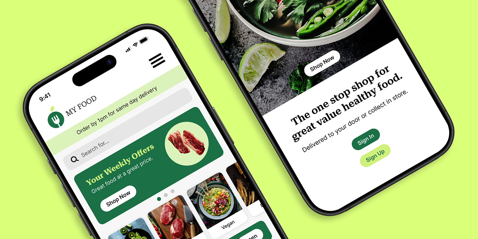
For this project I was tasked with redesigning the My Food brand identity including their mobile shopping app. My objective was to completely refresh the company branding to better reflect their ethos and make the app more intuitive and user-friendly.
The Problem
My Food has revolutionised the grocery shopping experience with a smart app digital ordering system. Highly trained personnel prepare the order for either home delivery or depot collection.
The problem is that, following a successful launch, sales have now decreased and app interactions are down. The company conducted user research and this revealed that customers found the app hard to use and were disappointed with replacements when items were out of stock.

500
Average number of App users per month

250
Average Number of users who buy goods

100
Average Number of repeat users
The Solution
My Food have subsequently implemented a state of the art stock check system so that the app is instantly updated when an item has sold out. Although the algorithm will recommend alternative products there will be no automatic replacements.
My Role
My role was to refresh the companies brand identity and redesign the mobile app to incorporate the system updates and improve the user experience. My initial task was to redesign the My Food branding to better reflect their identity. I created a clean, modern, graphical logo and a vibrant yet organic colour palette. Buttons and boxes have rounded corners to reinforce the theme and large touch targets for ease of use and accessibility.


Primary

Secondary

Tertiary

Canvas

Grey

Black
The User
Through research I created user personas that aligned with the My Food demographic and then made a user flow to map their journey through the app. This simple visual representation showed all the potential pathways and touch points and helps to optimise the user experience.
Prototyping
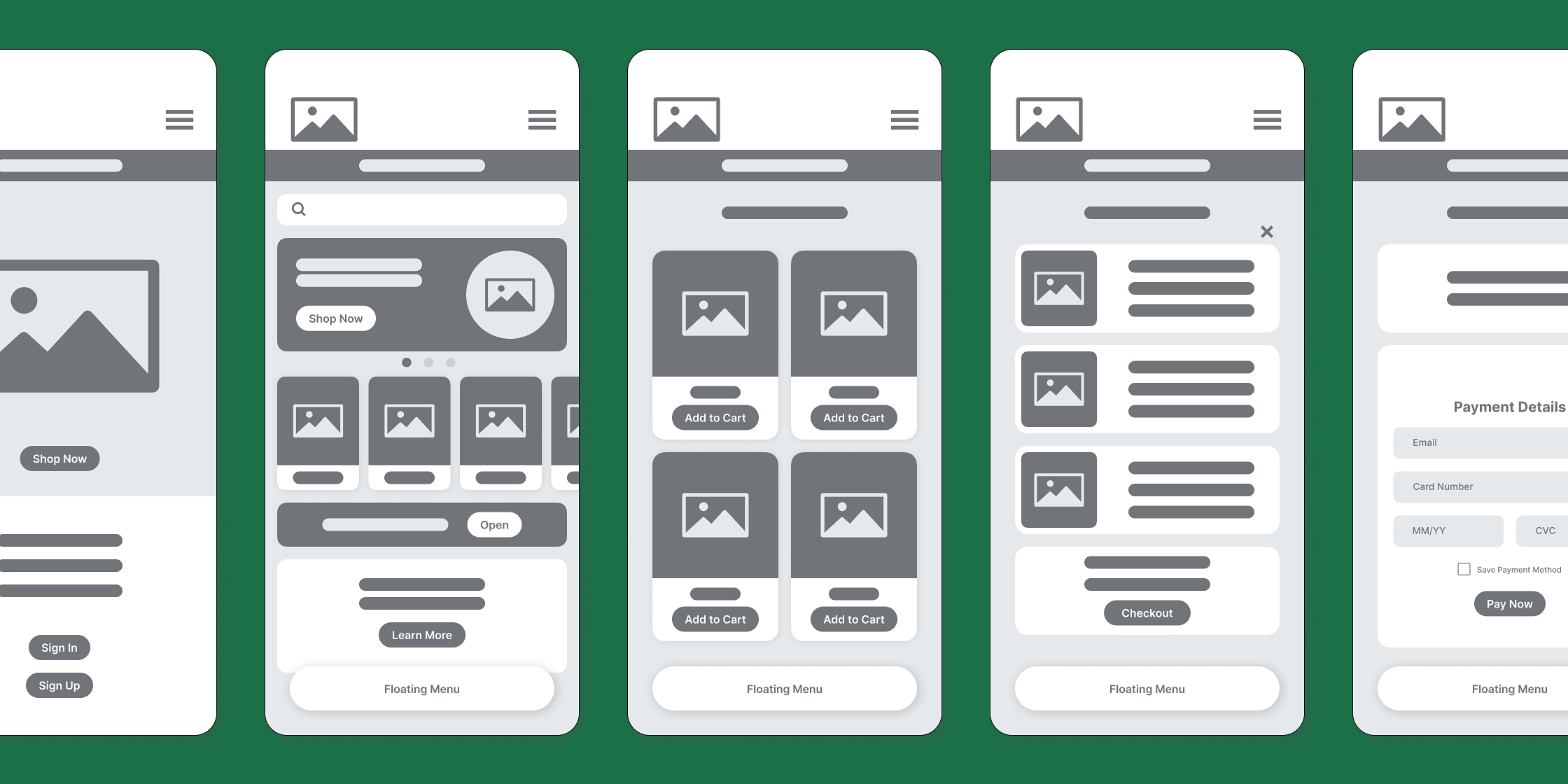
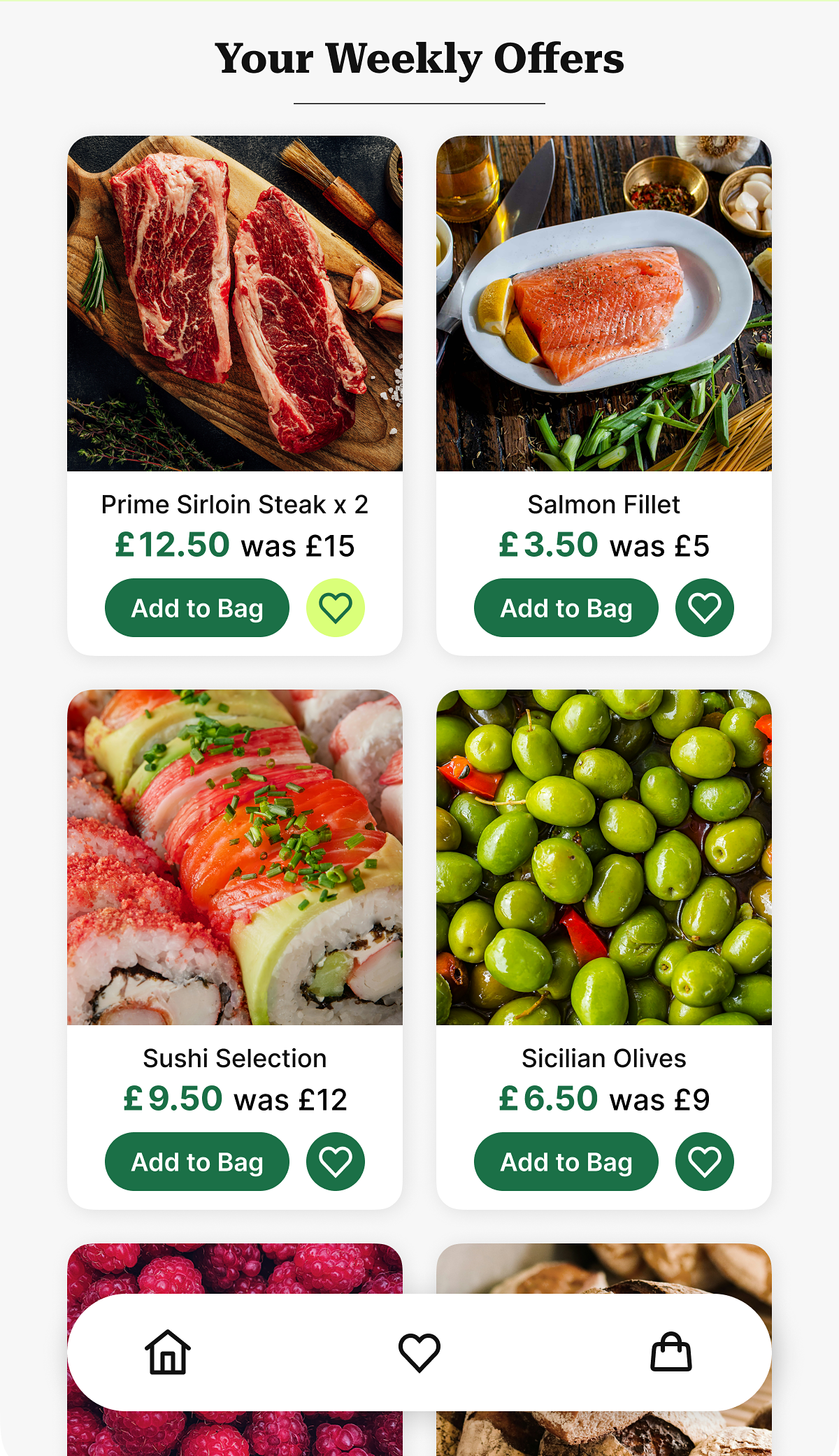
Next, I created mid-fidelity wireframes to test design concepts before progressing to interactive prototypes. Feedback from usability testing was very positive but users wanted the option to quickly save items to a digital shopping list. I fulfilled this need by adding a heart button to the product cards allowing customers to add items to a list as well as their shopping bag.
Other Projects
Dash
Digital Product Design

Wood Beaver
Branding Design
© SRD 2026
My Food
Digital Product Design
Client:
My Food
Sector:
Commerce
Project Overview
For this project I was tasked with redesigning the My Food brand identity including their mobile shopping app. My objective was to completely refresh the company branding to better reflect their ethos and make the app more intuitive and user-friendly.
The Problem
My Food has revolutionised the grocery shopping experience with a smart app digital ordering system. Highly trained personnel prepare the order for either home delivery or depot collection.
The problem is that, following a successful launch, sales have now decreased and app interactions are down. The company conducted user research and this revealed that customers found the app hard to use and were disappointed with replacements when items were out of stock.

500
Average number of App users per month

250
Average Number of users who buy goods

100
Average Number of repeat users
The Solution
My Food have subsequently implemented a state of the art stock check system so that the app is instantly updated when an item has sold out. Although the algorithm will recommend alternative products there will be no automatic replacements.
My Role
My role was to refresh the companies brand identity and redesign the mobile app to incorporate the system updates and improve the user experience. My initial task was to redesign the My Food branding to better reflect their identity. I created a clean, modern, graphical logo and a vibrant yet organic colour palette. Buttons and boxes have rounded corners to reinforce the theme and large touch targets for ease of use and accessibility.


Primary

Secondary

Tertiary

Canvas

Grey

Black
The User
Through research I created user personas that aligned with the My Food demographic and then made a user flow to map their journey through the app. This simple visual representation showed all the potential pathways and touch points and helps to optimise the user experience.
Prototyping
Next, I created mid-fidelity wireframes to test design concepts before progressing to interactive prototypes. Feedback from usability testing was very positive but users wanted the option to quickly save items to a digital shopping list. I fulfilled this need by adding a heart button to the product cards allowing customers to add items to a list as well as their shopping bag.
Other Projects
Dash
Digital Product Design

Wood Beaver
Branding Design
© SRD 2026
My Food
Digital Product Design
Client:
My Food
Sector:
Commerce
Project Overview
For this project I was tasked with redesigning the My Food brand identity including their mobile shopping app. My objective was to completely refresh the company branding to better reflect their ethos and make the app more intuitive and user-friendly.
The Problem
My Food has revolutionised the grocery shopping experience with a smart app digital ordering system. Highly trained personnel prepare the order for either home delivery or depot collection.
The problem is that, following a successful launch, sales have now decreased and app interactions are down. The company conducted user research and this revealed that customers found the app hard to use and were disappointed with replacements when items were out of stock.

500
Average number of App users per month

250
Average Number of users who buy goods

100
Average Number of repeat users
The Solution
My Food have subsequently implemented a state of the art stock check system so that the app is instantly updated when an item has sold out. Although the algorithm will recommend alternative products there will be no automatic replacements.
My Role
My role was to refresh the companies brand identity and redesign the mobile app to incorporate the system updates and improve the user experience. My initial task was to redesign the My Food branding to better reflect their identity. I created a clean, modern, graphical logo and a vibrant yet organic colour palette. Buttons and boxes have rounded corners to reinforce the theme and large touch targets for ease of use and accessibility.


Primary

Secondary

Tertiary

Canvas

Grey

Black
The User
Through research I created user personas that aligned with the My Food demographic and then made a user flow to map their journey through the app. This simple visual representation showed all the potential pathways and touch points and helps to optimise the user experience.
Prototyping
Next, I created mid-fidelity wireframes to test design concepts before progressing to interactive prototypes. Feedback from usability testing was very positive but users wanted the option to quickly save items to a digital shopping list. I fulfilled this need by adding a heart button to the product cards allowing customers to add items to a list as well as their shopping bag.
Other Projects
Dash
Digital Product Design

Wood Beaver
Branding Design
© SRD 2026